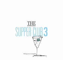
AN EXAMPLE OF THE PROCESS:
The Knowledge brand - it's all about distilling.


HOW WE GOT THERE.
The three most important rules for outdoor are:
a) Getting noticed.
b) Getting noticed.
c) Getting noticed.
True, it's the same for every advertising channel, but with outdoor your audience are moving, sometimes at speeds of 60mph.
So they just have the time to engage with your message.
Only simple works.
The more you distil your message, the more readers you add.
To distil, you need to be clear on what you want to say.
Then you want to get it down to three or four words and an image.
Ideally.
Brand idea and logo.
The benefit with starting with the brand idea and logo, rather than the advertising, is that you're forced to be simple.You are trying to give two words a meaning.
Don't get me wrong, there are some great logos that have no meaning, but if they do, they work harder.
They‘re more distinctive and for a relevant reason.
Take these four famous logos.
Don't get me wrong, there are some great logos that have no meaning, but if they do, they work harder.
They‘re more distinctive and for a relevant reason.
Take these four famous logos.

They're all for hugely successful businesses, so their logos aren't holding them back.
But two are linked to their specific companies and two are typography.
Let's swap the styles and names around.
But two are linked to their specific companies and two are typography.
Let's swap the styles and names around.

Aside from looking slightly odd, you can see that two don't lose anything, Tesco and Coca-Cola are simply represented by different fonts.
Whereas Amazon loses the idea behind their business 'everything from A to Z'.
And Walt Disney loses its founders' signature.
Having bespoke logos is another one of our preferences.
You can only create a bespoke logo if you understand the business.
It's history, its quirks, what it offers, the role it plays in people's lives, everything.
We looked at their previous logo:

It gave us no clues.
It was just typography, maybe that’s why the client is looking to change it?
John Connel had previously set up The Week magazine.
It was just typography, maybe that’s why the client is looking to change it?
John Connel had previously set up The Week magazine.

It described itself as 'a weekly snapshot of what’s happening today and why. Distilled from dozens of the world’s most trusted news sources’.
The Knowledge had one similarity, it edited other news sources words down, and two major differences; it was daily and digital.
So what should it stand for?
The meaning of the word ‘Knowledge’ is too broad.
What made them different was sourcing a wide range of articles from the left and right, then radically distilling them into small, daily chunks.
The web drowns you in an ocean of information, this was like a life raft.Not the whole pie, a tasty slice.
So we rejected ideas based on ‘knowledge’.

And diversity.

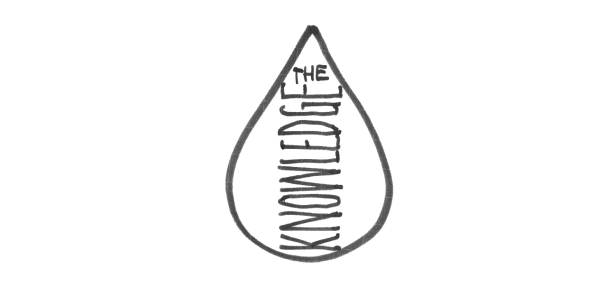
We need an idea that graphically represents a piece.Like a drop of...

Or a torn corner (of something bigger)...

Or the word KNOWLEDGE distilled, tiny next to THE.

Or the word ‘knowledge being tiny next to the generic, huge ’the’.

The two finalists.
To gauge them, we placed them at the top of their newsletters.
To gauge them, we placed them at the top of their newsletters.


The big ‘THE’ was preferred.
But wondered whether the 'THE' was just too dominant.
So we changed fonts, opting for the more intelligent looking serifed look.
But wondered whether the 'THE' was just too dominant.
So we changed fonts, opting for the more intelligent looking serifed look.

Advertising.
We find it helpful to separate messaging from aesthetics.
So we show ideas in their raw state; scribbles.
Not only does this save time image searching and photoshopping, it forces everyone to focus on the idea.
Not get seduced by gloss.
David Bowie had a similar theory ‘if a song sounds good on a bad guitar I know it’s good, it’ll only get better in the studio’.
Sometimes it’s obvious what a brand should say, sometimes it helps to compare and contrast, to try a few ways in.
The Knowledge was the latter.
Because we had a lot of questions.
Should we lead with the benefit (knowledge), followed by its conciseness?


Or focus on the psychology of not knowing?


Or focus on how little time we want from you, but attitude?


Or contrast the tyranny of choice the internet offers with our condensed, curated version?


Maybe we position it as an easier way to digest your daily news?


Maybe we lean into ‘less’ in a disruptive way?


Maybe we frame it as a sample of news, like a taster?


Or poke fun at our laborious, under-edited rivals?


Although editing stories from other news outlets is still our difference?


Reviewing the work, we noticed that the ideas with witty images had more energy and implied that The Knowledge offered more interesting content.
Almost subliminally.
Using the globe as a shorthand for news, then shrinking it to suggest distilled news felt strong and playful.So we focussed on fleshing out that area.
Almost subliminally.
Using the globe as a shorthand for news, then shrinking it to suggest distilled news felt strong and playful.So we focussed on fleshing out that area.


We decided ‘News made manageable’ wasn’t a headline, it was an end line.
It should follow the name of the product.
Leading with the name meant we could make it bigger (not terrible when you're promoting a new product).
We created a lock-up, and introduced colour to make it feel less serious.
Globe colours seemed to make sense.
It should follow the name of the product.
Leading with the name meant we could make it bigger (not terrible when you're promoting a new product).
We created a lock-up, and introduced colour to make it feel less serious.
Globe colours seemed to make sense.

Images:
They could be shot and photoshopped, but illustration felt better.
They would give us a distinctive, ownable style, but who could we get to illustrate it?
We don't need one who delivers lovely looking images, we need one understand ideas.
The New Yorker is a good place to look, they use a lot of them.
Our search narrowed to Brian Cronin (Boat), Miguel Porla (Woman), Tom Gauld (New Yorker cover) and Harry Campbe (insulin).


They are all great illustrators, but, we felt that if the idea is about distillation, our illustrations shouldn't look like they took a long time to do.
They should look quick, instant and have an urgency.
They should look quick, instant and have an urgency.


“The ads captured our personality perfectly and stood out in what is a very competitive market of different news offerings.”
- Jon Connell, Founder of The Knowledge.
MORE OUTDOOR EXAMPLES:


_The%20Economist_Dave%20Dye%20%26%20Sean%20Doyle_AMV_BBDO_FINAL.jpg)
_Chipotle_Mother_Dave%20Dye.jpg)

