AN EXAMPLE OF THE PROCESS:
Mishcon de Reya - it's all about updating.
Before.

After.

HOW WE GOT THERE.
'Refreshing' is tricky.
Change too much and you may look desperate, change too little and nobody notices.
But that was the task Mishcon de Reya gave us.
They felt their materials didn’t accurately capture their personality.
The capo di tutti capi of graphic designers, Paul Rand, once said “Design is the silent ambassador for your brand”. So if your ambassador doesn’t understand your company, you have a problem.
Mishcon de Reya aren’t like other law firms - they have swagger, they're seen as rebellious, possibly even swashbuckling.
Let’s take a look at their materials.


Genteel.
Generic.
Whimsical.
And disparate.
When using verbs like rebellious, swashbuckling and swaggering, the context is crucial; compared to other law firms.
Not compared to tech, music or financial firms.
So let's not get too carried away creating 'rebellious' design systems - they’re still a legal firm.
People don't choose lawyers because they're hip, cool or rebellious.
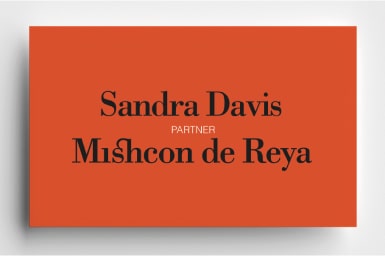
THE LOGO.

Excellent.
Untouchable.
But why had it faded to grey?
Once, I engaged Mishcon de Reya to settle a dispute.
They sent the company a fax*, the company phoned me within 10 minutes of recieving it.
(*It's like a paper email. From the before times.)
One reason was at the top of the fax was the biggest, blackest letters known to man, stating MISHCON DE REYA.
It looked scary.
Which is useful in their line of business.
Not that the brief should be to make Mishcon appear scary, but they should look strong.
So in terms of their logo, let's take Amy Winehouse's advice, let‘s go back to black.

FONTS.
They had three.
But if you counted all the variations, the italics and various weights, they had 34.
Multiply these by the three colour options and you could put together hundreds of different styles, looking like completely different companies and still be 'on brand'.
e.g.
But if you counted all the variations, the italics and various weights, they had 34.
Multiply these by the three colour options and you could put together hundreds of different styles, looking like completely different companies and still be 'on brand'.
e.g.

Obviously that's presenting too many personalities.
But which font captures the right one?
Choosing a font is like casting a voice.
It changes the way the words are received.
It can sound like...
But which font captures the right one?
Choosing a font is like casting a voice.
It changes the way the words are received.
It can sound like...

or...

So picking the appropriate one is crucial.
Bodoni, Gill and Sabon were the fonts used.
We wanted to get it down to two, one that delivered personality, and a secondary, very readable font for text.
Let's have a look at the three.
Bodoni, Gill and Sabon were the fonts used.
We wanted to get it down to two, one that delivered personality, and a secondary, very readable font for text.
Let's have a look at the three.

We're talking law, so which would you take most seriously?

For us; it was Bodoni (top).
Another positive with that font is...
Another positive with that font is...

COLOURS.
We've already chosen black and we have to have white (paper, etc), which leaves their signature colour; orange.
It's their signature colour, people recognise it as theirs - so why change it?
But what orange?
It's their signature colour, people recognise it as theirs - so why change it?
But what orange?

ILLUSTRATION.
In the current style, articles about serious, weighty subjects are embellished with whimsical illustrations.
It feels tonally wrong, let's switch to photography.
It feels tonally wrong, let's switch to photography.
PHOTOGRAPHY.
Black and white photography would look contrast well with our orange, and look more stylish.


It also suggests more gravitas.
And would visually tie together a wide range of disparate images, from stock shots to commissioned, from people to buildings, news, you name it.
Black and white imagery would unify them
Which helps us present a consistent face.
And would visually tie together a wide range of disparate images, from stock shots to commissioned, from people to buildings, news, you name it.
Black and white imagery would unify them
Which helps us present a consistent face.

Now we know the style of imagery, we need a guide on something more important; the content.
Too serious.

More human.

Unfocussed.

More focussed.

The usual.

More surprising.

Too cliched.

More playful.

IDEA.
How do we use these tools we've chosen in a way that captures Mishcon de Reya's distinct personality in a way that is distinctively theirs?
We thought back to a previous meeting where the CEO talked about them being 'seen as slightly rebellious within the legal world'.
Slightly.
How do you show a little rebellion?
Isn't that an oxymoron?
Then I remembered reading Paul Smith's book.
He described his design philosophy ‘classic with a twist’.
For example, one of his chalk stripe suites may look sober and classic from a distance, but up close you'll spot unusual details.
Loud stitching around a single buttonhole...

Garish lining.

One odd button.

Small acts of rebellion.
We need the graphic equivalent for Mishcon.
But it needs to have a reason for being.
Not simply an affectation sellotaped on top.
A thought occurs; in their business a misplaced apostrophe can cost someone million pounds.
They have to be detail-obsessed.
Nit-picky.
Let's use radical punctuation, let's highlight our punctuation.
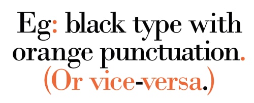
But only in headlines.
It would get tiresome in lots of text.
Mishcon loved it, we applied it.
It would get tiresome in lots of text.
Mishcon loved it, we applied it.
BEFORE:

AFTER:


There you have it; looks different and the same.
"The new identity really brought the Mishcon brand to life.
Enabling us to bring a coherent look across our client and marketing touchpoints"
- Kim Lansdown, Marketing Director, Mishcon de Reya.
MORE DESIGN EXAMPLES:
Enabling us to bring a coherent look across our client and marketing touchpoints"
- Kim Lansdown, Marketing Director, Mishcon de Reya.
MORE DESIGN EXAMPLES:


